


 Like most of you, I was totally confused when looking at Skew-T charts, not knowing what the lines were or what they were trying to tell me. Over the course of several weeks, I dribbled pastrami and rye over my keyboard, trying to find meaning in the charts on the web. I learned a lot, and thought I would pass along what it took to develop the thermal tool that I now download on every day I think it will be flyable on the west side, and even on some days I think it will be light and thermally at Makapuu.
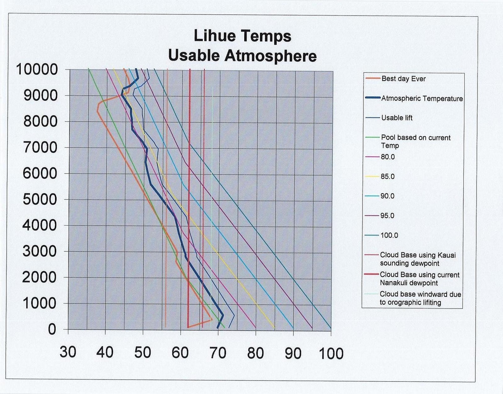
I’ll start with the basics. The thick blue line is the line that shows the temperature of the atmosphere as you leave from sea level. A balloon is released from Kauai twice a day, once at 2am and then again at 2pm. As you can see the temperature of the atmosphere changes quite a lot and even increases in some places. The light blue line is just a line drawn 3 degrees higher than the atmospheric sounding. I put this on the chart because I read somewhere that sailplane pilots predict the top of the usable lift when the temperature of lifted air gets within 3 degrees of the actual temperature. Our sink rate is about twice that of a sailplane, but I figured it was close enough, and I’ll cover the lifted portion more later.
The vertical lines represent the dew point based on different observations. The thick red one is the dew point from the weather bug station at Nanakuli. Since I am most interested in the west side I figured I’d make that one stand out. The thin red line is the sea level dew point based on the atmospheric sounding (it is hidden behind the thick one on this chart); the light blue line is based on a Kailua weather bug station and should represent the windward side; and the thin orange line is the Nanakuli dew point on the last epic west side day.
The slanted lines are adiabatic cooling lines of lifted air (I’ll call them thermal lines). All that means is if you take a parcel of air at sea level and lift it, that line will represent that parcel's temperature at any given height. The rate at which it cools is based on some thermodynamic laws, and roughly represents how a thermal cools when it travels upward. All these lines are parallel because a thermal that starts at 80 degrees cools at the same rate as one that starts off at 90 or 100 degrees. You will notice that the rate of cooling slows, i.e. the line gets steeper just after it crosses the thick red line. This is because wet air cools at a slower rate than dry air, another thermo thing we don’t really have to worry about - it just does. It roughly represents how a thermal will cool once it has reached cloud base. Again more to follow on cloud base. I chose to put the slanted lines 5 degrees apart for ease, and it seems to me that our thermals during the winter follow the 85 degree line. The thin green line is taken from the current temperature at Nanakuli just as a reference. As you look at the tool as the day progresses, you will see that line move to the right as the day heats up, and then to the left as the day cools in the evening. I put this line on there to see if I could learn which of the other lines would best represent the temperature of a thermal, hence the 85 remark earlier. I think as summer comes around we will see that temperature rise.
So what does all this mean? Its simple: hot air rises and cools. This chart is a representation of how it will happen in our atmosphere. Here are the basics from the chart. A thermal will stop rising when the slanted line it travels on crosses the sounding line (thick blue one). A thermal that starts off hotter will rise further. On this chart, thermals less than 90 degrees will stop just above 9000 feet, but thermals hotter than 95 degrees will continue to rise. The normal inversion here is between 5000 and 7000 feet, so air stops rising at that altitude.
Now is the time to talk about cloud base. For that we will be using the vertical lines, and each represents a different dew point. The day/time this chart was generated there was a 4 degree difference between the windward and leeward dew points. If you follow the yellow line (85 degrees) it results in about an 800 foot difference in cloud base between the windward and leeward side of the island. Another thing to note is how much lower the dew point was on the epic day. Just the dew point difference results in base being several thousand feet higher on the epic day. How does surface dew point determine cloud base, you ask? Think about it this way. If the air at the surface was cooled in the same way as in the evening, at the dew point at which it starts to drop dew, when that happens to rising air it creates a cloud. So how do we use these vertical lines to predict cloud base? The air that rises is air from the surface, so it should create a cloud when it reaches the dew point. As air heats it moves from left to right on the X axis. When it finally breaks away from the ground, it takes with it air that has the dew point of air at the surface, so as it cools (shown by one of the thermal lines) it will make a cloud when it has cooled to the dew point. Thermals that get hotter before they leave the ground have to rise higher before they reach the dew point, so therefore cloud base is higher for a hotter thermal. Again it seems like the yellow (85 degree) line seems to correspond with Nanakuli the best.
So now that we know where the cloud forms and where the thermal stops rising, we can predict clouds. If the thermal lines cross the dew point line and then the sounding line, we can predict the cloud base and top. If the thermal line crosses the sounding line before the dewpoint line, we will have no clouds, because the thermals will stop rising before they cool enough to create a cloud: these are known as blue days. We can also guess that if there is a large gap between cloud base and the top of the thermals (cloud tops), the day may overdevelop and rain.
What else can the chart tell us? I think it can predict the strength of the day. I haven’t been observing for long enough to be sure, but it seems the strength of the day will be determined by the difference between the sounding line (thick blue) and the actual thermal lines. This chart is a good example of the difference in days. On the epic day (orange) you can see how much further to the left (colder) the atmosphere was than on the one represented by the blue line. I would expect that the orange day would have been a day with higher climb rates than the one shown. So what makes an epic day? Its simple: low dew point, a good inversion just above the height the thermal lines cross the dew point line, and good separation between the sounding line and the thermal lines. The reason I say a good inversion is because that is the key to preventing overdevelopment.
It took me 10 years to figure this stuff out. I hope this helps you guys accelerate that a bit. Feel free to ask me about the tool any time. It will be easier if you have a copy of it with you.
5 comments:
Doug, this is great. I've been following along as you've developed your tool over the past few months, and trying my best to make sense of it all, but I have to admit I've been a little fuzzy on some points, and this posting is a very nice and clear explanation of what each part represents.
Doug, Thanks for taking the ime to explain all the lines. Really appreciate you sharing your thermal tool. It's still gonna take me a little whle to understand it though.
Two people have complained that they can't post comments to this article - if you are having trouble posting, please call me at 223-0144 so I can help you troubleshoot the problem - I'd really like to figure it out. Thanks!
Nice tool and summary. I used to run a similar tool in TX for our flatland sailplane site and our low PG hill. Quite accurate for high aerotowed SP, but I couldn't make it correlate much to low level footlaunch conditions. So take my comments for what they're worth, the voice of forecasting failure speaking to the voice of success :)
We had a distant upwind and downwind sounding station in contrasting microclimates. In that case it helped to average the quite different results of the two; averaging the balloon readings was suggested as even better. Some say to favor the upwind side due to the time delay. Hilo is questionable though. Although sometimes upwind for the lower airmass, I think the balloon then rides air flowing up the saddle between volcanos. You can see weird numbers suggesting land effects (and I've paraglided there - weird zone).
Another issue is the temperature gap between background and thermal. A big one may not correlate to strength. Look at the 2pm curves, and you may often see the incremental filling in of the background temp to match your lower temp lines like 80 degree. At least in the high flatland case the thermals push up the heat, so the next thermals have to be hotter to have much boost. Hill case may be different, but an elevated trigger point violates some assumptions of these curves anyway.
You wondered if the SP-standard 3 degrees was enough for a thermal to support a PG. May be sufficient, because I don't think your tool is accounting for humidity of thermal vs dryer elevated air. In areas of high dewpoint like here, it can account for further 4 degrees according to "virtual temp" paragraph of readme . Moist air is buoyant (lots of H2), although maybe you won't reach much dryer upper air. Also note their "thermal index" paragraph, which downplays the factors of temp differences in favor of height of convection - I've heard that is nearly a consensus, at least at non-mountain sites.
One other thing is those vertical dew point lines - shouldn't they curve 1 degree every 1000 feet? The dewpoint doesn't stay constant but drops down with less pressure as shown in CloudCalc .
Dewpoint only stays constant if the pressure does, and less air pressure can hold less water. Well now I am confused about whether to tilt those dp curves left, right or not, but you will be less rusty on the subject and can sort it. The thermal slope should close on dewpoint lines by 4.5 per 1000feet but have an absolute slope of 5.5?
Post a Comment